
The Modern Footer replaces the theme footer, making it simpler to customize it using the block editor.
- improves user experience, thanks to updated content guidelines
- simpler to customize, using the block editor
- improves SEO by moving administrative links away from the header and sidebar
- improves accessibility with better heading structure
Jump to:
Kadence
The Kadence setup doesn't use the Modern Footer, please see the Kadence Tutorials instead.
1. Enable the Feast Layouts
Enable the Feast Layouts before proceeding.
2. Setup
Setting up the modern footer has been streamlined, getting you set up with a basic template that you can modify as needed.
To convert to the Modern Footer, simply navigate to the Feast Plugin's Settings page and you'll see a button to "Create the Modern Footer".

You need to edit the default content, links and text to match what you have on your site. The default content is just there as a placeholder. Modifying this should take less than 5 minutes.
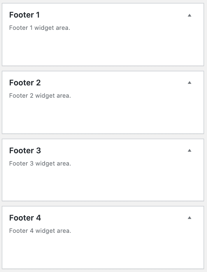
After setting the Modern Footer how you like it, be sure to remove all widgets from the footer widgets area:
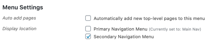
and toggle off any secondary navigation menu:
Video
Editing
There is a (edit modern footer) link available directly below the Modern Footer only when logged in as an admin (this is not visible to non admins).
Click that link to take you to the block editor for the Modern Footer, where you can edit it like any other post.
Purpose
It's important to start with what the purpose of a website footer is.
The footer is the last section of your page, which means that when someone lands there, they're looking for something they didn't find on the rest of your page.
* make sure your e-mail address is obfuscated to bots by using Cloudflare
There are "administrative" links commonly found here, which you should include links to:
- Contact
- Privacy Policy
- Terms and Conditions
- ADA (Accessibility) page
- "Work with me"
If you have any of the above links in your primary navigation menu, they should be removed and placed into the footer instead.
Most of these pages are going to be standalone pages, and you may want to disable Yoast breadcrumbs on that specific page.
In addition to the administrative page links, you can also enhance the Modern Footer with:
- Copyright statement
- If applicable: Amazon disclaimer
- "As seen in"
Footer navigation
The navigation menu in the footer is built using the block editor, as a simple list with linked text.
This is in contrast to the theme footer, which required setting up a new navigation menu in an entirely separate section of WordPress, and then navigating a confusing user interface.
Width
The desktop footer is 1140px wide.
On mobile, the width is 360px.
Make sure that anything you put in the footer is designed to look best on mobile, first and foremost.
That means inserting images (such as "as seen in" features) at a maximum of 360px width, and laying out the rest of the footer so that it stacks nicely on mobile.
Note: you can upload any width image you want, and may want to use 720px so that there are retina-quality images being displayed when supported.
Layout
We've provided a default 3-column template for desktop layout. This is because it will look roughly the same on mobile (360px width) as it will on desktop (3x 360px columns).
We do not recommend using full-width images, because these are unreadable when resized from 1080px down to 360px, and creates accessibility problems.
Site copyright
To add or edit the site copyright with the Modern Footer, simply edit the copyright line as a regular paragraph.
In the themes, the site copyright was specified in the Customizer via theme settings. After setting up the Modern Footer, the customizer setting is disabled and you'll edit the copyright statement directly in the block editor.
Keyword optimization
The footer is not the place to perform keyword optimization.
Build the footer exclusively for your users, not search engines.
Subscribe
We'll be adding guidelines down the road for a call to action for subscribing to the newsletter. Initial details can be found in the rethinking the newsletter post.
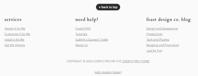
Back to top
We've provided a "back to top" link so that users can quickly navigate back to the top of the page to access the content. This is a small user-experience enhancement.
The Modern Mobile Menu makes navigating the site easier, by sticking the navigation menu bar to the top of the browser window as the user scrolls.
Pagespeed
The footer will add DOM nodes to your page, and because of this you don't want to go crazy inserting a hundred links.
Keep the footer focused on necessary pages and user enhancements.
Accessibility
We recommend that the links in the footer follow standard accessibility practices, and are colored like normal hyperlinks as well as underlined.
You also want to run your page through Webaim's WAVE accessibility tool to ensure both the text and the links in your footer have sufficient contrast.

There are also certain restrictions on headings for accessibility -
Headings
As a standard accessibility practice, there's a hidden H2 heading for the footer.
If you want to use headings in the footer, please use only h3s. Avoid over-use of headings in the footer as they're not necessary and can cause accessibility issues.
Notes
- https://www.orbitmedia.com/blog/website-footer-design-best-practices/
- https://www.mockplus.com/blog/post/website-footer-design
- Accessibility statements: https://www.w3.org/WAI/planning/statements/
Styling
The Modern Footer takes a mobile-first approach and has styling that matches the page content.
This is because on mobile devices, the user has no distinction between the main content, sidebar content and footer content.
It's all one continuous page.
This is a departure from the theme footer setup, which is styled primarily for desktop, where the footer (and sidebar) are designed to look distinct from the rest of the site.
You can style apply custom styling to the footer element via the "Additional CSS" screen (as footer styling is site-wide), but we recommend minimizing this.
.site-container > footer, body > footer {
	background: #f7f9fc;
	padding: 27px 0;
	color: inherit !important;
	text-transform: inherit !important;
	letter-spacing: inherit !important;
}
.site-container > footer a, body > footer a {
	text-decoration: underline !important;
}
This adds a bit of a background (customizable to match your brand), some spacing, and undoes some of the theme styling that makes the footer visually different from the rest of the page.
Note: For some reason, the footer is part of the .site-container on posts, but not on the homepage. For this reason, we need to add fallback styling for the footer being a part of the body instead of site-container.
You want your footer to match the overall branding and styling of your website. We recommend not applying any special styling to the footer.
Update Copyright year
Once a year you'll need to update the year in the Modern Footer:
Mediavine
If you're running Mediavine ads, you'll need to reach out to them to notify them of this change to prevent sidebar ads overlapping the footer.
Translation
See translating the Feast Layouts.
Patterns
Patterns do not load in the footer. The footer is individually styled and should not be repeated in other places on your site.
The footer is always full width, and should be built to use 300px sections to ensure the mobile layout looks the same.